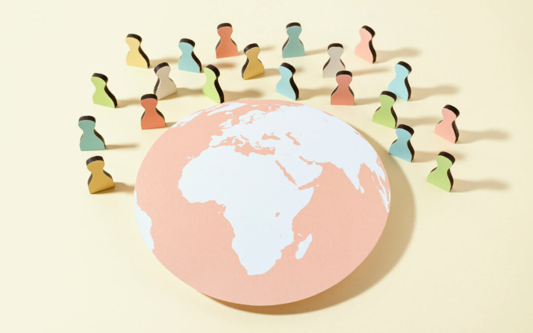
Trends in design are often dictated by cultural changes that continuously happen around the world. This year, on the other hand, was also a small exception. By quarantining us very often, Covid-19 has caused a more dramatic change in the field of digital design, forcing us to delve deeper into the digital world, thus changing the way we have lived our lives so far.
The biological need of every social person – to be constantly interacting with others, contrary to the authorities’ recommendations to “stay in our homes”, has created a kind of challenge for web designers. So how to create real experiences and make them digitally accessible to everyone?
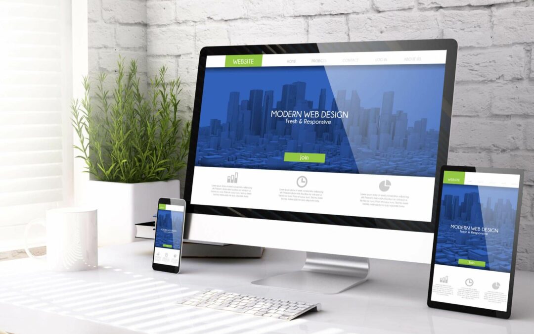
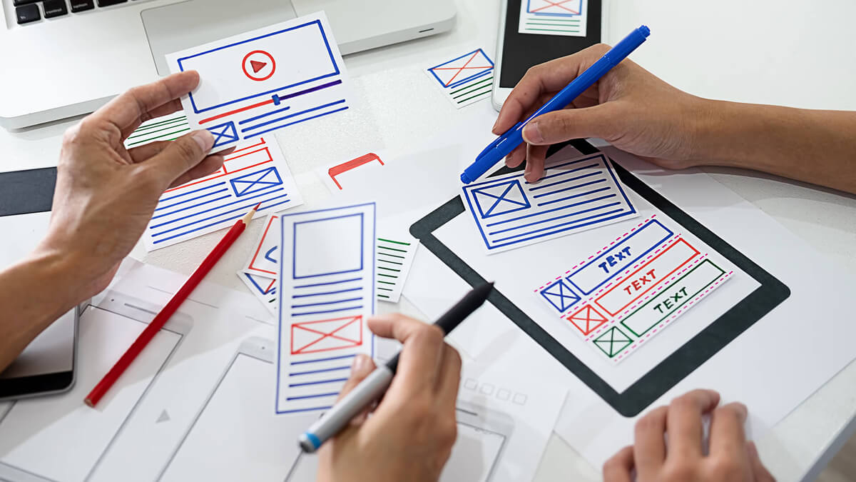
Web designers and developers tried different ways to adapt to new circumstances. Some of them proved to be very successful in that race for better visual pleasure and better website traffic. New standards in typography, unusual color schemes, various 3D simulations of products for online customers are just some of them.
In this text, we will try to single out for you a couple of those who fit into different industries and user personalities. Right from the start, we would like to point out that applying these innovations is not just an aesthetic decision. Implementing a more considerable amount of them does not necessarily lead to more significant traffic and better user review.
The most important thing is to carefully analyze the industry to which you belong and select accordingly. So, the emphasis is on quality and not quantity!
Fonts and Typography
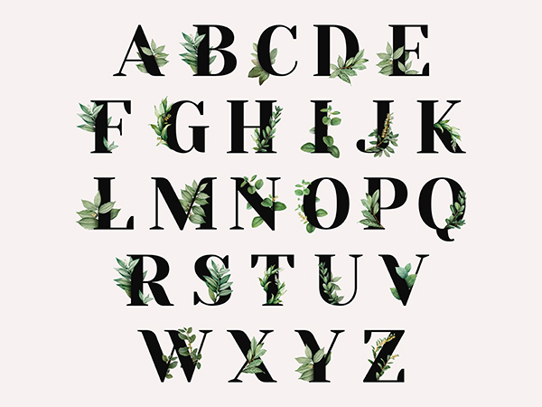 Sans serif fonts have always been a prime choice for web designers because of their elegant and easy readability and simple structure. This love originated primarily due to the smaller size and resolution of the screen in some earlier periods. However, screen sizes and resolutions are larger and more apparent than ever before. Contrary to their “outdated” predecessors, screens which now design more attractive to the decorated, harder, sheriff fonts. For example, larger screens allow sheriff fonts to look less cluttered and more comfortable to read – thanks to the increased space around the words. In the same way, the higher resolution makes that the letters appear more clearly.
On the other hand, designers today often resort to animated and typographic elements that use phrase or collection of words for decorative purposes. Animated word strings will usually be structured as a specific shape instead of the standard horizontal sentence format from left to right. However, its role will always be decorative, not as a read text. Designers usually use this technique to convey branding or marketing target, creating the desired vibe or visual topic.
Use of E-moji’s
Ok, first of all, who doesn’t love emojis?! They’re cute, sweet, and can make everyone’s day better at any given moment! Their popularity has forced web designers to classify them as their favorite tool. Utilizing these illustrated “faces” is now a practical, easy way to present brand moods and non-verbal messages in a language familiar to users of all backgrounds. Communication with the target audience of all languages and dialects progresses with this technique – the voice of your brand can now be heard in a visual, non-verbal way.
Colors, Pallets, Illustrations
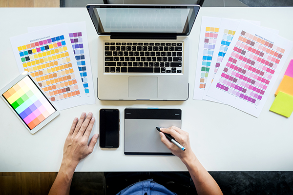 One of the most significant differences in design between a website and traditional printing is using softer, lighter colors. Opposite to conventional print, the use of lighter color in web design is far more present, where they retain wealth and do not look opaque and dull. The soothing effect of bright colors often encourages users to stay longer on the page, enjoying the color palette’s color palette’s serenity and warmth.
On the other hand, the trend of bright, bold colors has not entirely disappeared. More and more designers are gravitating towards the use of very bold colors, with a harmonized emphasis on red, blue, and yellow as the primary colors. This trend in the design aims to an animation of younger audiences by emphasizing an optimistic and exciting atmosphere.
Finally, we must also mention the increasingly present implementation of outlined border boxes around some website elements. These black lines and borders can vary in thickness and are often used by designers as partitions for pages, especially as dividers of different sections on the page.
Simplicity of Shapes
The artistic style of the 90s era also returned to web design trends – this time in the form of motifs of simple shapes integrated into design schemes. These simplified two-dimensional illustrations of the shape boast a single shade of color, without depth or texture.
Wrap Up
Almost no one with certainty, taught by the events of this outgoing 2020, can say what awaits us in the New 2021. From a web designers’ perspective, one thing is for sure, though. The New Year will certainly bring new opportunities. In this wasp area of novelty, it is essential to recognize the quality and properly implement it. It is crucial to achieve your prime goal and make your website stand out compared to your rival’s ones.